
7 Essential Elements Every High-Converting Landing Page Needs
Discover the core components that separate effective landing pages from ineffective ones and learn how to implement each element strategically.
Read ArticleMaster the fundamental design principles that convert visitors into leads. Learn proven layout patterns, visual hierarchy techniques, and responsive design strategies that actually drive results.

The difference between a landing page that converts and one that doesn’t often comes down to one thing: layout. It’s not about fancy animations or trendy colors. It’s about making sure visitors see what matters, understand what you’re offering, and know exactly what to do next. When you nail the layout, everything else becomes easier.
We’ve worked with dozens of landing pages—some crushing their conversion goals, others struggling. The ones that win share common patterns. They use whitespace strategically. They guide your eye naturally down the page. They make hierarchy crystal clear. And they work beautifully on phones, tablets, and desktops.
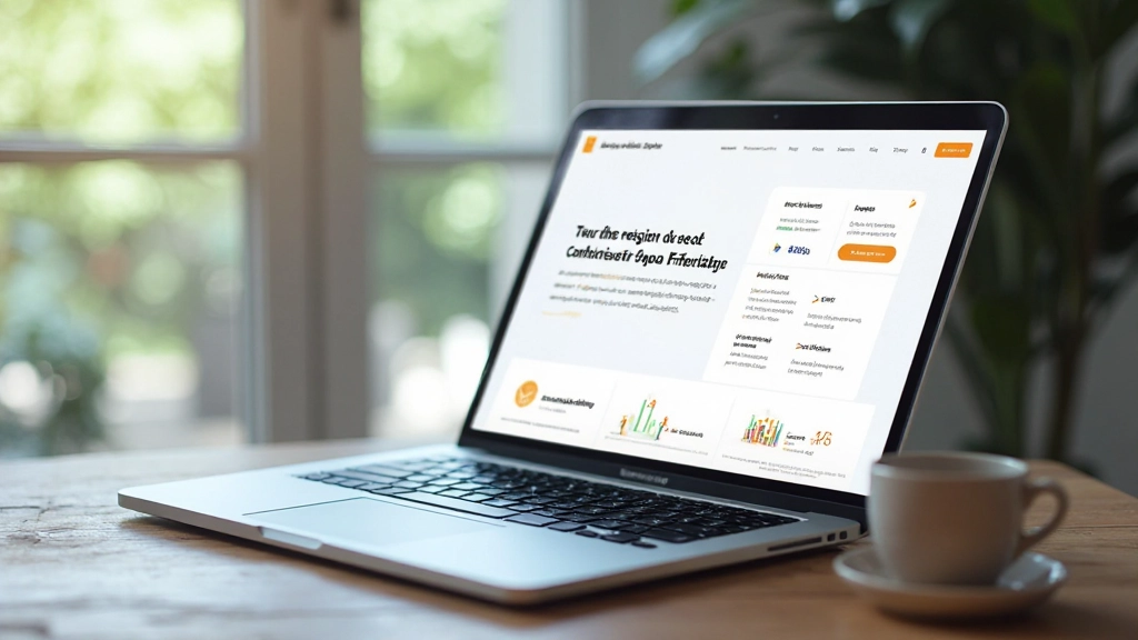
Above-the-fold is the space visitors see before they scroll. On desktop, that’s roughly 600-800 pixels. On mobile, maybe 300 pixels. This real estate is premium. You need your most compelling message here.
Don’t waste it on generic text. Your headline should answer one question immediately: what’s this page about? Not “Welcome to our site” but something specific. “Generate 10x more qualified leads with conversion-focused landing pages.” Now visitors know what they’re getting.
Visual hierarchy guides visitors’ eyes through your page in the order you want. It’s created through size, color, spacing, and contrast. Bigger text gets attention first. White space separates concepts. Bold colors draw focus.
Here’s what we’ve learned: visitors scan pages. They don’t read word-by-word. They look for headlines, jump to images, spot buttons. If your hierarchy is clear, they’ll navigate intuitively. If it’s muddled, they’ll bounce. Your H1 should be noticeably larger than H2s. H2s should be bigger than body text. Every element’s size should signal its importance.
Color works too. Use your brand color strategically for important elements—buttons, headlines, accent text. Don’t spray it everywhere. One or two accent colors, used deliberately, create impact. More than that feels chaotic.
Whitespace—the empty area around content—seems like wasted space. It’s not. It’s actually one of the most powerful design tools. Whitespace makes content breathe. It reduces cognitive load. It makes pages feel premium instead of cramped.
Think about luxury brands. Their websites feel spacious. Content isn’t packed tight. There’s room around headlines, images, buttons. Compare that to a cluttered discount site where everything’s squeezed together. Which feels more trustworthy?
For landing pages, we recommend: minimum 40-60px margin around major content blocks on desktop, 20-30px on mobile. Section padding between 60-100px vertically on desktop, 40-60px on mobile. It sounds like a lot, but it’s what separates good design from great.
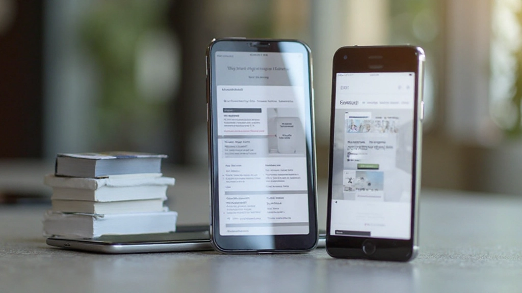
Over 60% of traffic is mobile now. If your landing page doesn’t work beautifully on phones, you’re losing more than half your visitors. Mobile-first design means you design for the smallest screen first, then enhance for larger screens.
This changes everything. On mobile, two-column layouts become one column. Large images scale down. Text gets bigger for readability. Buttons become thumb-friendly (at least 44x44px). Forms collapse to single-column input fields.
Great landing page design isn’t magic. It’s mastering a few core principles and applying them consistently. You’ve got to nail above-the-fold with a compelling headline and clear CTA. You need visual hierarchy that guides visitors naturally. You’re using whitespace generously—not cramming content. And you’re building for mobile first, then enhancing for larger screens.
When you combine these practices, something shifts. Visitors understand your message immediately. They move through your page without confusion. They know exactly what you want them to do—and they do it. That’s when conversion rates improve. That’s when landing pages start earning their keep.
Start with your next landing page. Audit it against these principles. Does your above-the-fold area immediately communicate value? Can you see the visual hierarchy clearly? Is there enough breathing room? Does it work beautifully on phones? If you’re missing any of these, you’ve found your improvement lever.


This article provides educational information about landing page design best practices and layout principles. The design recommendations shared are based on common industry practices and user experience research. Results may vary depending on your specific industry, audience, and implementation. We recommend testing these principles on your own landing pages and adjusting based on your analytics data. Design trends and best practices evolve continuously, so revisit these fundamentals regularly to stay current with emerging patterns and technologies.